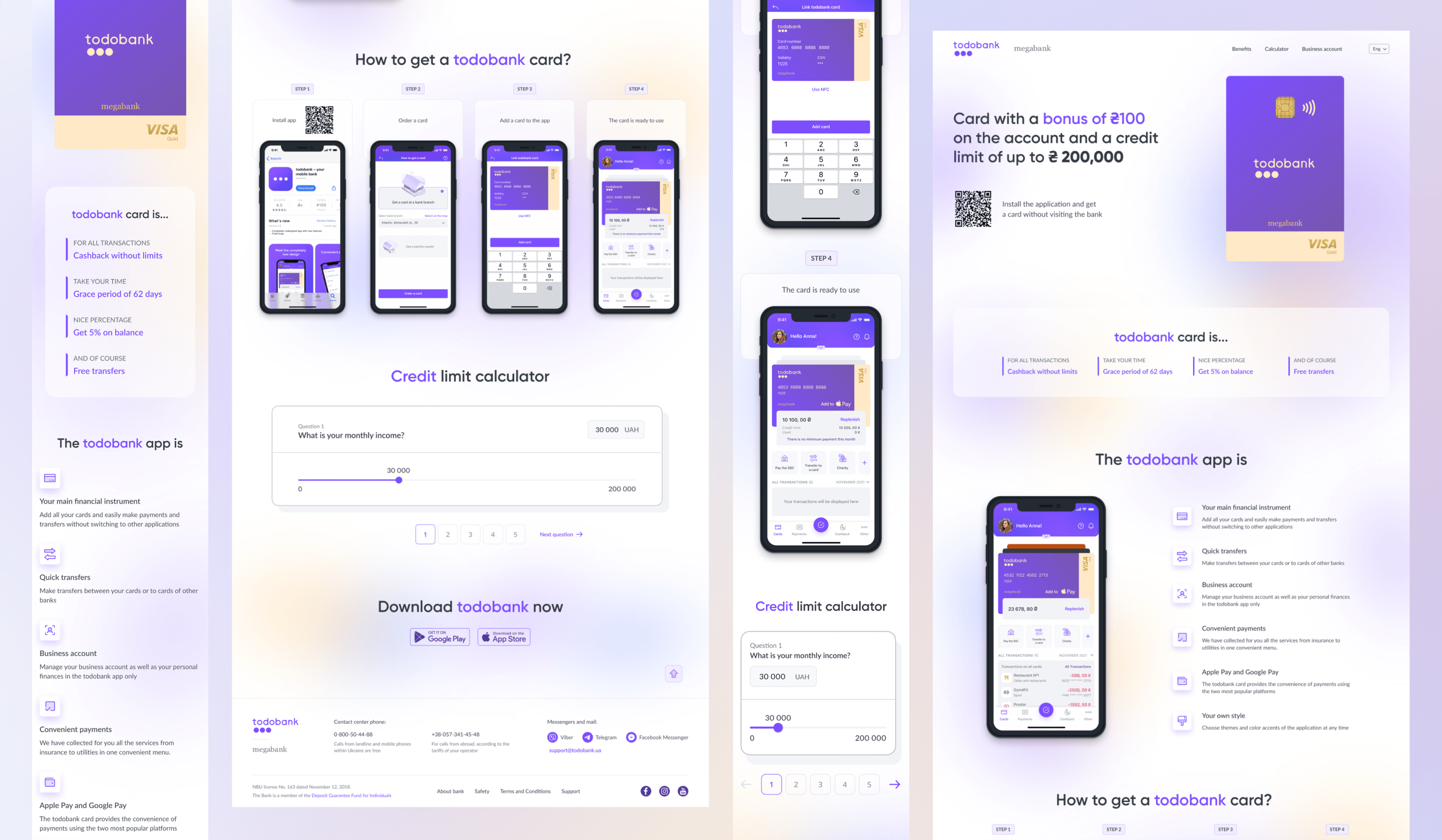
TODOBANK 2.0 - PROMO LANDING
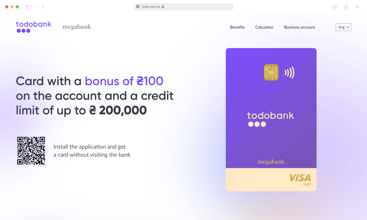
The best way to sell the product
As the part of product sell strategy of new version of online banking app for one of the biggest banks in Kharkiv, Ukraine – Megabank, we created a promotional landing page where the main content that motivates to order is shown on the first screen along with the amazing premium design of the card – making customers want to own it.
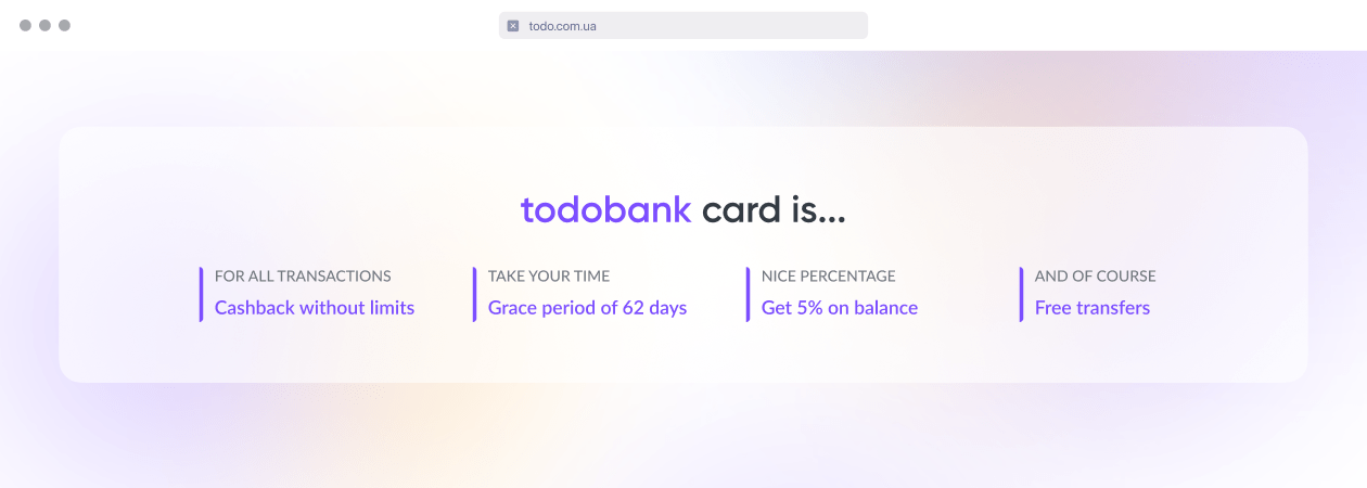
Product advantages at a glance
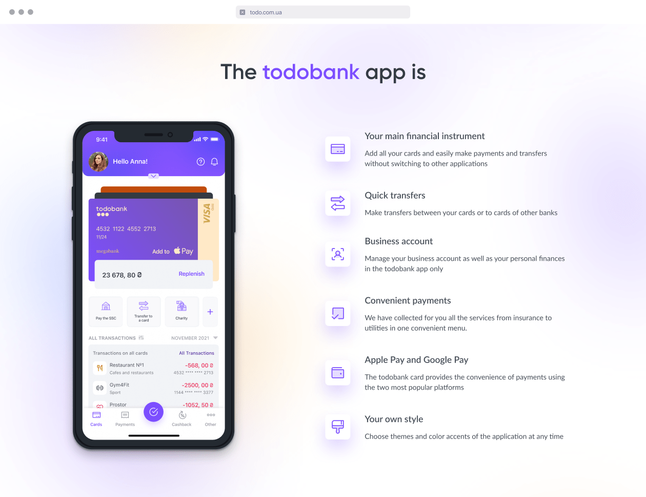
App installation and
setup roadmap
App installation and
setup roadmap
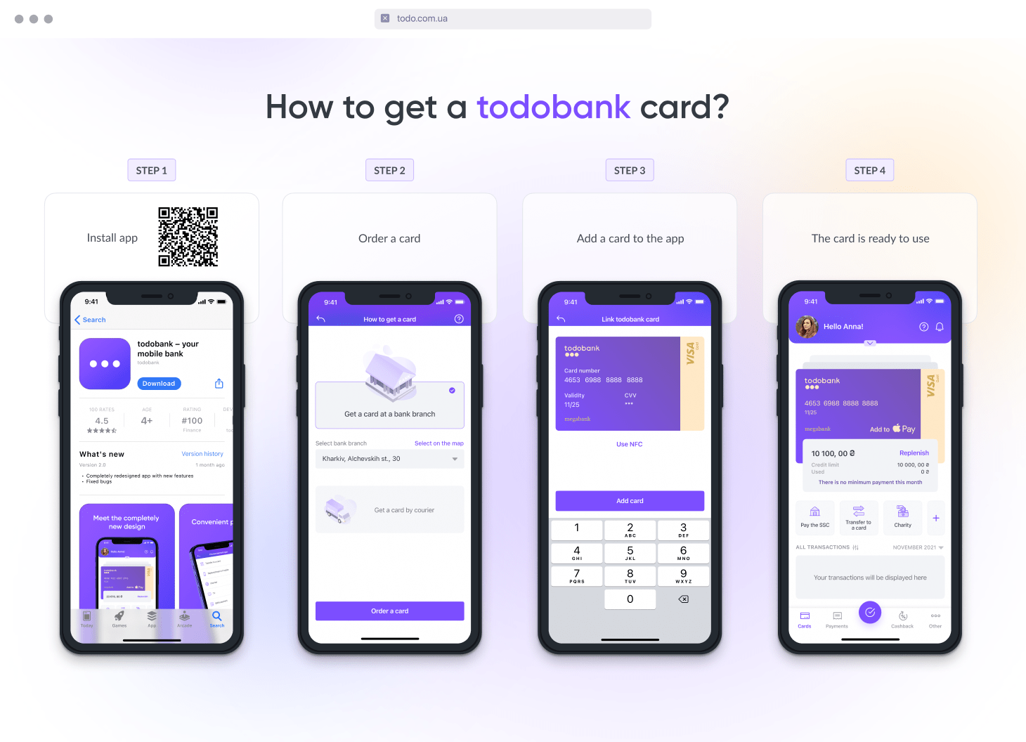
We developed an easy 4 step roadmap to show the clients how easy then can get our product

Micro-animations create a pleasant impression on the client and emphasize the attention to detail and premium products
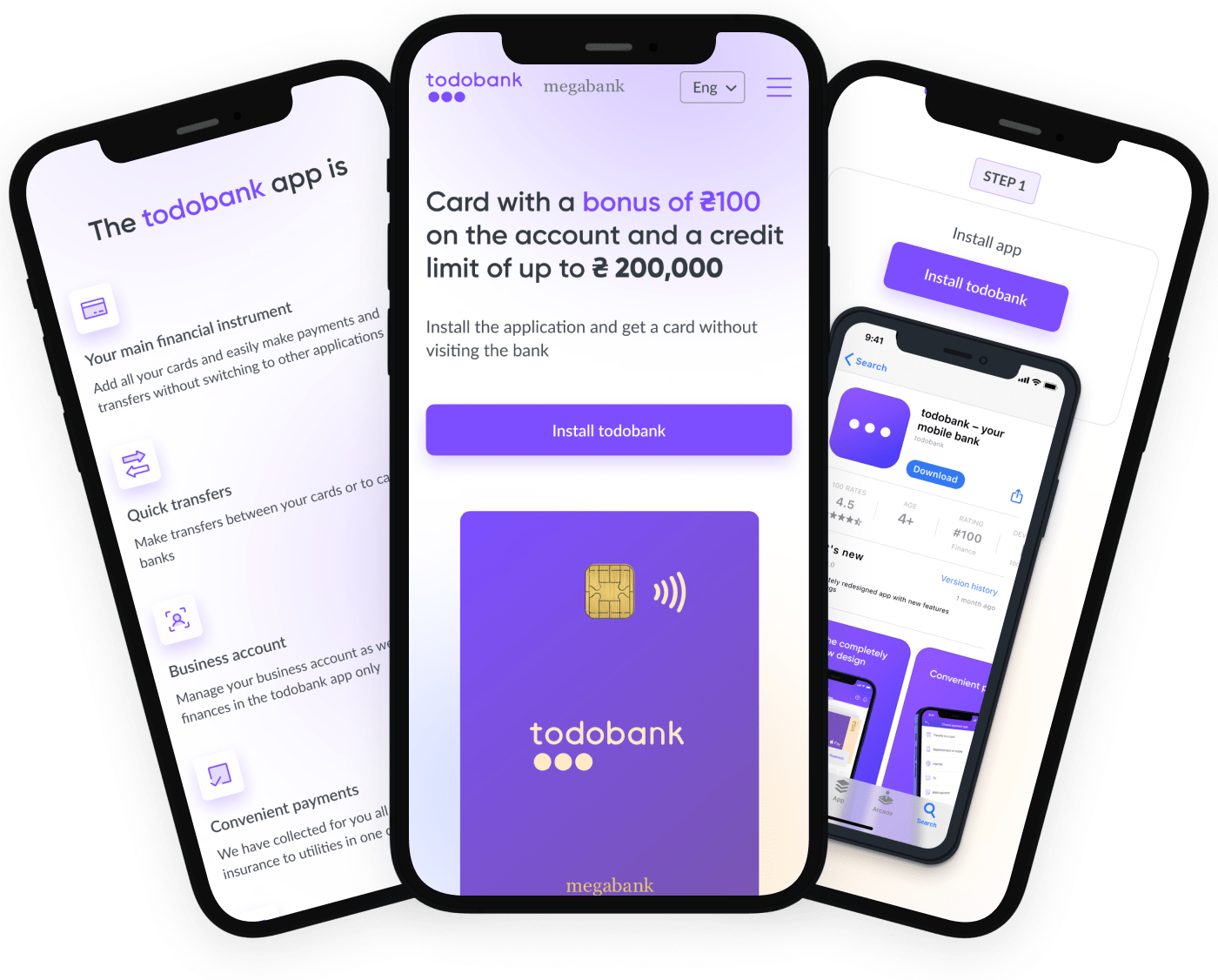
We created designs for the mobile version and our developers made great adaptivity to be sure that the product presentation will look perfect on any device and screen resolution.
Review

Our customers were unhappy with our app so we turned to Yevhen and his team. Having thoroughly understood the needs and problems of our customers, as well as analyzing the market, they gave us a result that exceeded expectations!
Technology
- HTML5

